A Bank Becomes an Open Architecture Firm Full of Biophilic Elements

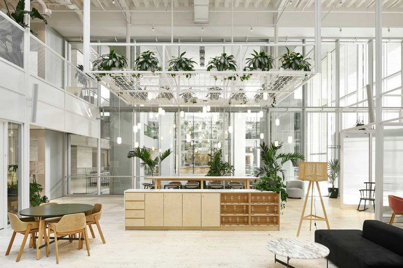
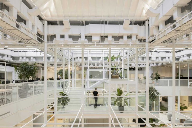
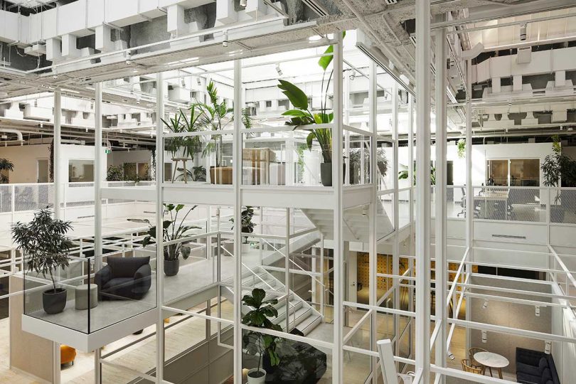
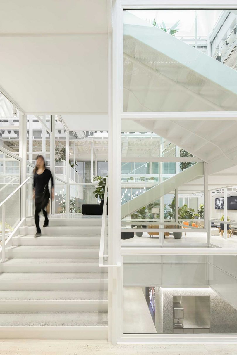
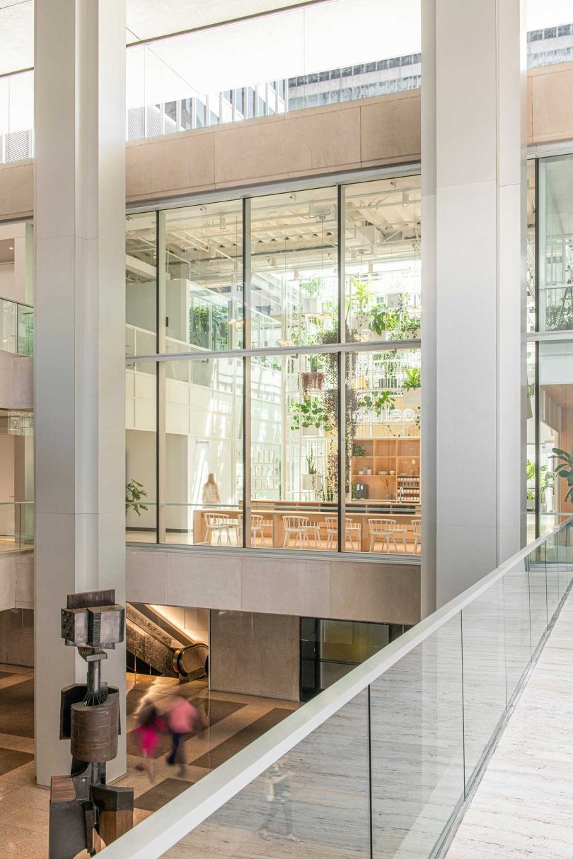
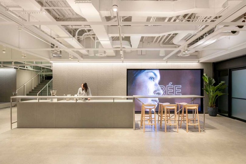
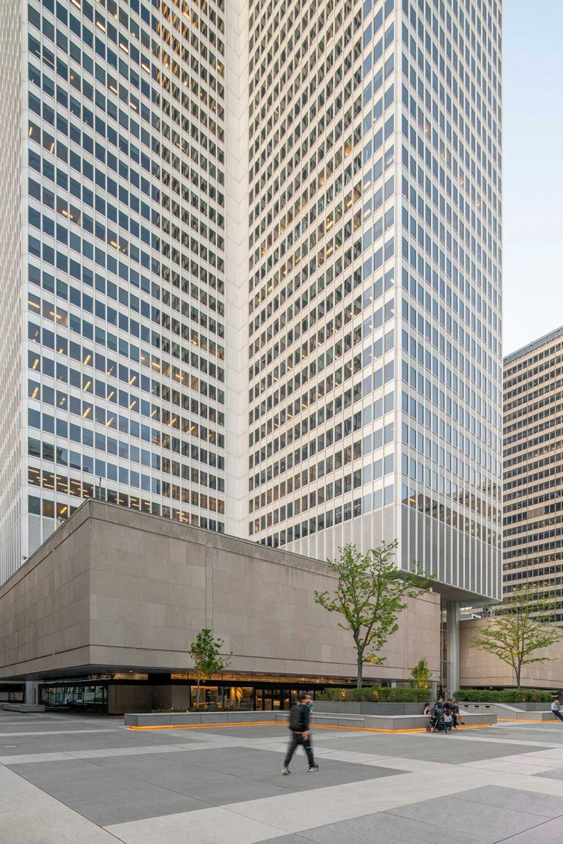
Formerly occupied by the Royal Bank of Canada, Sid Lee Architecture has created new offices for the firm as part of a larger project of revitalizing the notable Place Ville Marie complex and its esplanade. The agency is committed to the revitalization of downtown Montreal, starting with the Sid Lee Biosquare, a campus that blends the outside city with the offices inside. The interior is seen as an extension of the urban exterior thanks to its grid-like structure and biophilic elements. The grid creates open spaces while still allowing the various departments to coexist harmoniously.

A Bank Becomes an Open Architecture Firm Full of Biophilic Elements

Photo: Maxime Brouillet

open office interior with white infrastructure and plants throughout

Photo: David Boyer

Sight lines are kept open to visually link all the spaces and the people moving throughout. Not just visually, though, as the grid structure physically unites all the different spaces, levels, and people. The structure also creates mezzanines that look as if they’re floating mid-air. Green plants in varying sizes and species are placed throughout adding life to the industrial grid.

open office interior with white infrastructure and plants throughout

Photo: Maxime Brouillet

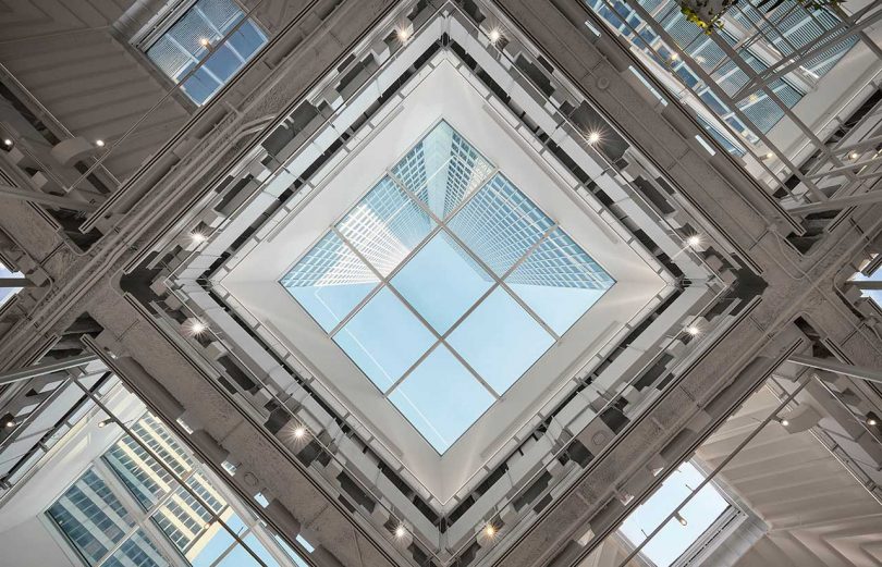
No matter where one is standing, the eyes are led up through the white grid and to the skylights, which were stripped back to their original structure.

open office interior with white infrastructure and plants throughout

Photo: Maxime Brouillet

open office interior with tall ceilings and skylights

Photo: David Boyer

open office interior with white infrastructure and plants throughout

Photo: David Boyer

open office interior with white infrastructure and plants throughout

Photo: David Boyer

Photo: Maxime Brouillet

all white office interior seating area with white furnishings

Photo: Maxime Brouillet

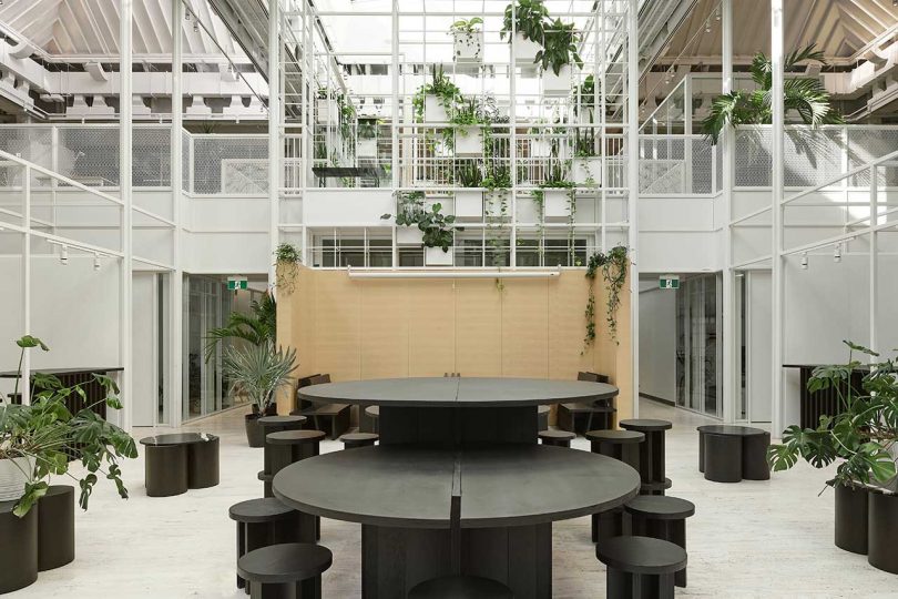
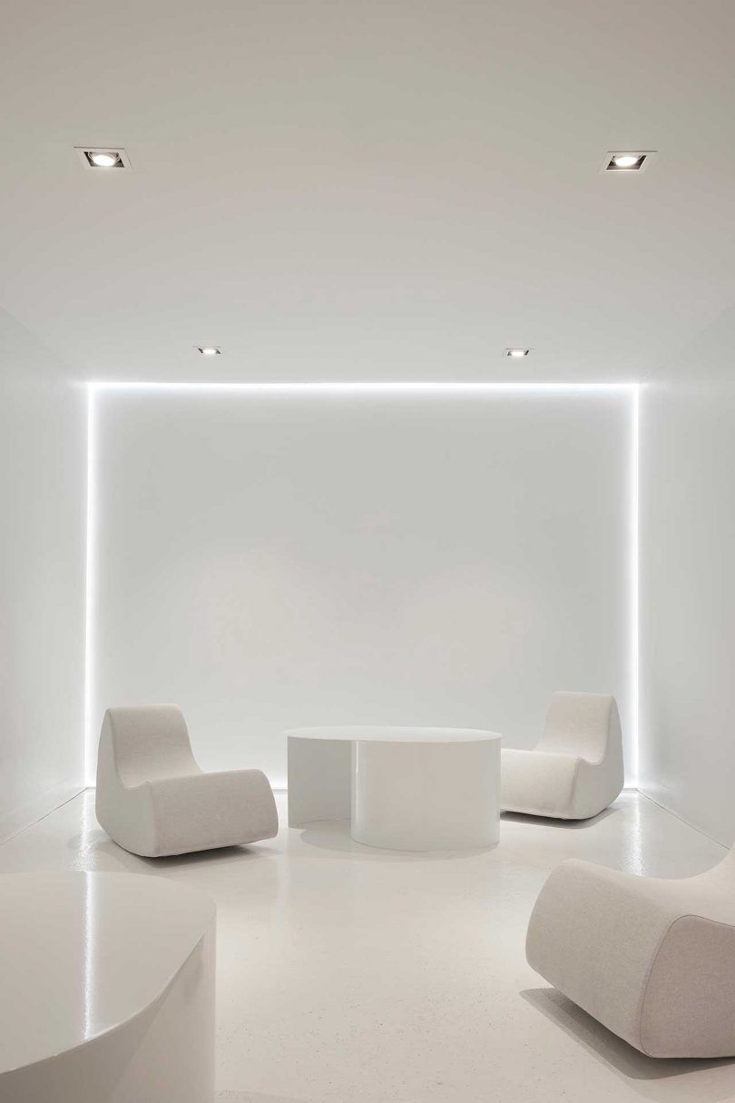
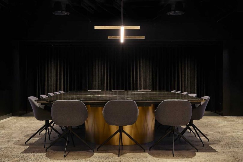
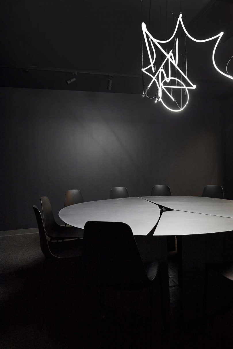
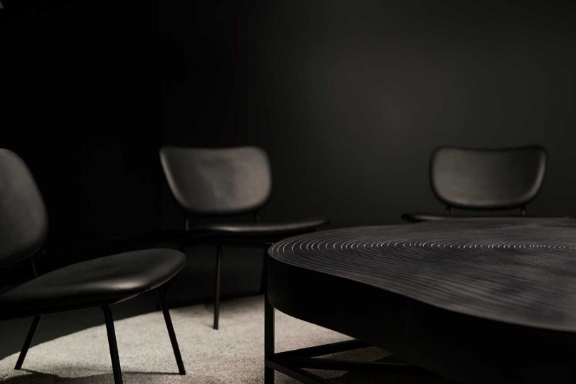
Around the open central part of the space are smaller environments for different types of working situations, from conference rooms to individual workstations. The spaces are accented with Lambert & Fils lighting, bringing in unique sculptural elements to the minimalist rooms.

dark dramatic conference room of office with black walls and dark furnishings

Photo: Maxime Brouillet

office interior conference room in all black with round table and chairs

Photo: Maxime Brouillet

office interior conference room in all black with round table and chairs

Photo: Maxime Brouillet

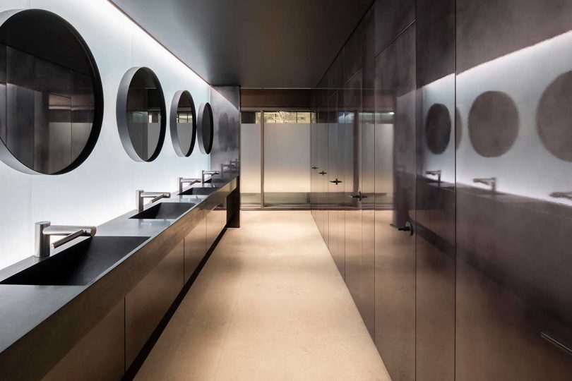
modern bathroom of office

Photo: David Boyer

reception desk of office

Photo: David Boyer

exterior view of tall office building

Photo: David Boyer

Caroline Williamson is Editorial Director of Design Milk. She has a BFA in photography from SCAD and can usually be found searching for vintage wares, doing New York Times crossword puzzles in pen, or reworking playlists on Spotify.

Related Posts

Comments

LEAVE A REPLY

Please enter your comment!
Please enter your name here

Stay Connected

spot_img

Recent Stories